Deuce
Role: UX Researcher
Tools: Figma, Google Suite, Slack
Duration: 5 weeks
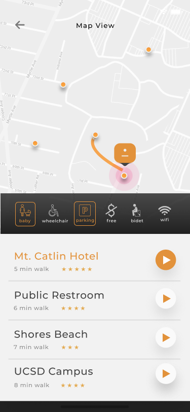
Deuce aims to guide travelers to their ideal public restrooms in familiar and unfamiliar locations
Process
For Deuce, my focus was on project management and research.
- Organizing scrum style production on Slack
- Made crucial design decisions that focused on minimal but meaningful user interactions
- Competitive analysis chart comparing top competitors, Toiler Finder and Flush


Research
Personas
- Mothers
- Frequent Travelers
- Travelers with accessibility needs
Competitor Analysis
Deuce was compared to Toilet Finder and Flush; it has the following features:
- Traffic indicator of a restroom's current user flow.
- Wider range of amenity markers than both Toilet Finder and Flush.
- Verification system on crowdsourced restrooms which enabled the ability to detect and block off residential areas.
Ideation
Feedback
User Testing & Data Analysis
- 15 out of 15 found their location
- 15 out of 15 found the features at Shores Beach
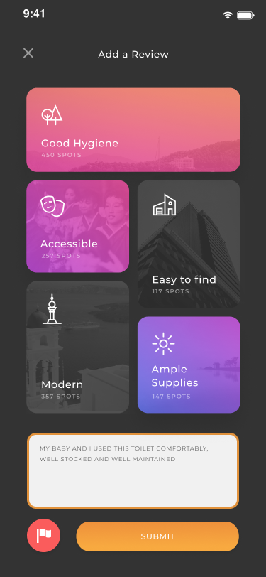
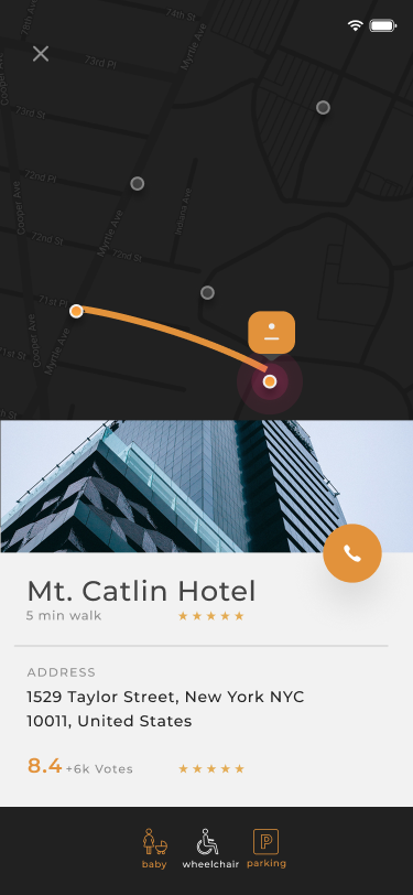
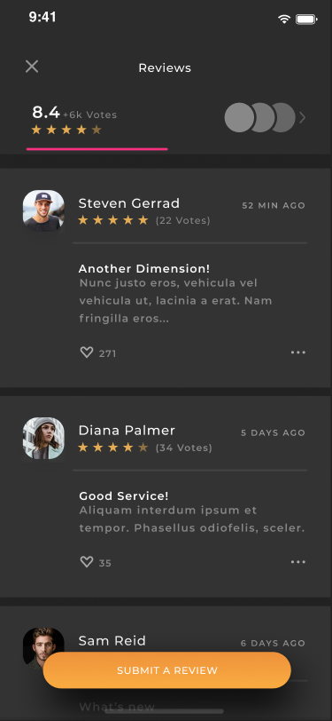
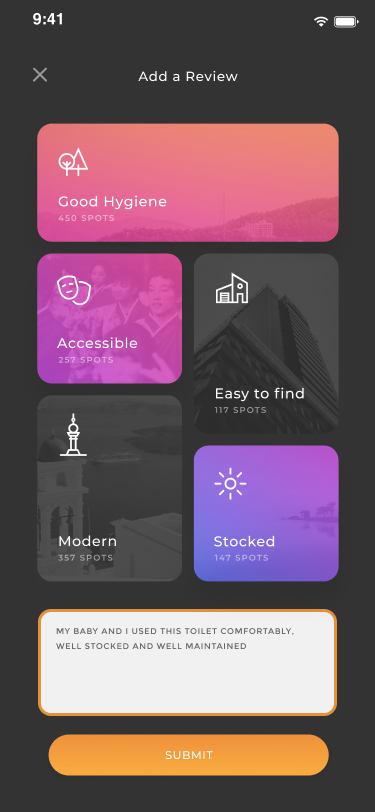
- 11 out of 15 were able to place a review at Mt. Catlin Hotel
-
Other notable pain points:
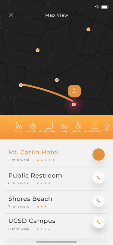
- Call button at the list view page
- X button
- Excessive clicking
- Dark map
Written by my colleage, Vivian T.
Redesign
- Included reviews in toiletpage
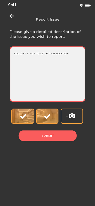
- Added a report page
- Changed colors to be mor visible
- Changed phone button in list view
Initial Design


Post-Feedback Design
